

-
How to actually get it built.
The reason most personal sites never ship is that they are redesigned three times before anything goes live.
Pick the site's one job.
Write the first sentence.
Design one page, one width.
Send it over, set breakpoints.
Connect your domain and publish.
-
The rules that make it finish
Write before you design. The first sentence is the hardest part of a personal site and no layout decision can rescue a page that has not decided what it says.
One width first. Design the desktop page, get it published, then handle the narrow layouts. Designing three breakpoints in Figma before anything exists is how a weekend becomes a quarter.
Publish at 80%. A live site with three case studies beats a perfect one with six that nobody has seen. You can add the fourth next month.
Put a date on it. One line at the bottom saying when it was last updated does more for credibility than another animation.
Personal website examples, and what makes them work
Eight kinds of personal site, what belongs on each one, and the four mistakes that make the rest forgettable. Structure first, because that is the part a screenshot cannot teach you.
Start for free -> See the Figma pluginThe seven templates shaped like these.
These are Siter.io’s own templates rather than other people’s sites: the six portfolios and the one-screen page, which are the seven of the twenty shaped like a personal site. Each one is shown as a whole page rather than a thumbnail, so hover a card to scroll it or open it at full size. All twenty website templates.
-
Portfolios
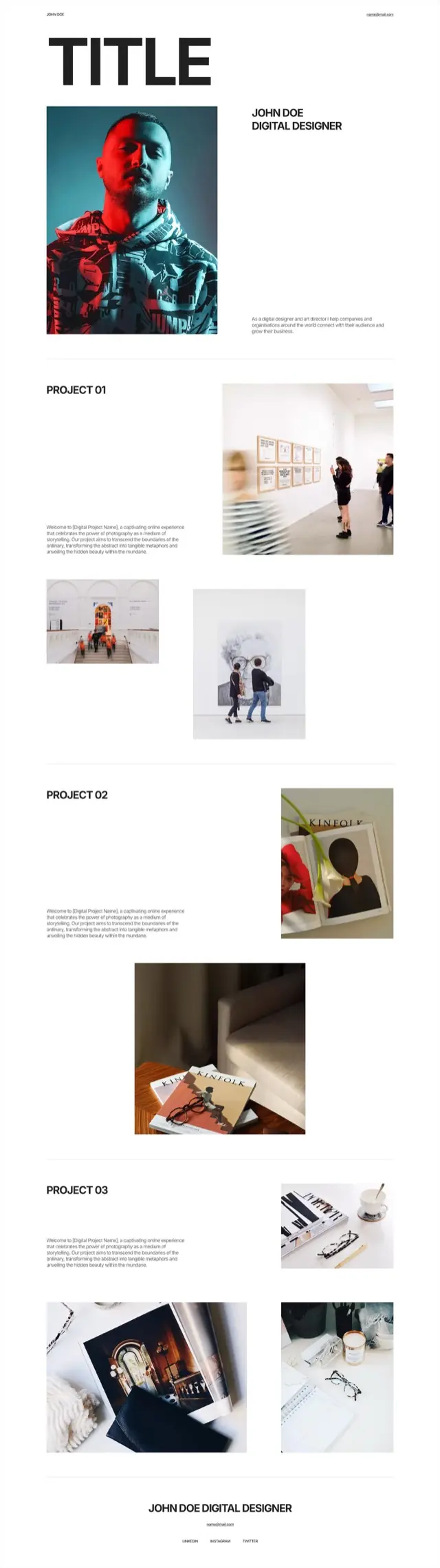
Typographic portfolio template
One enormous word across the top, a portrait under it, and then projects numbered rather than named. Images are placed off the grid on purpose so the eye moves rather than scans.
Oversized wordmark, portrait with intro, three numbered projects with staggered image pairs, name and contact footer
-
Portfolios
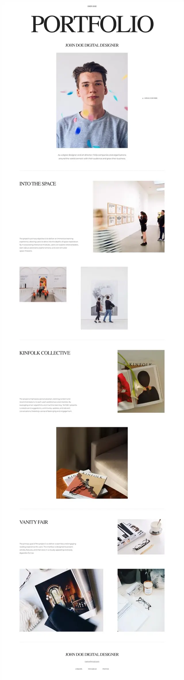
Editorial portfolio template
Centered, serif and quiet. The projects carry real names instead of numbers, and a scroll cue sits beside the portrait because the page expects to be read rather than skimmed.
Serif masthead, centered portrait with scroll cue, three named projects with mixed image sizes, centered footer
-
Portfolios
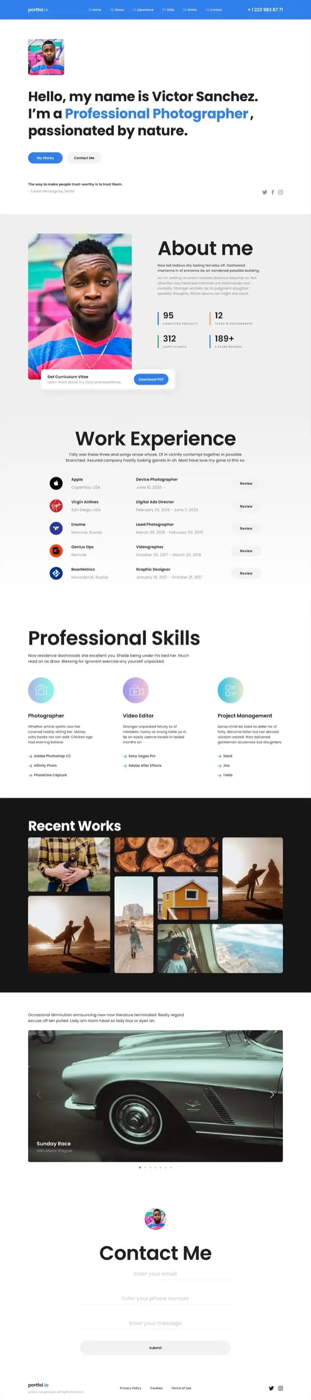
Photography portfolio template
The most CV-like page in the set. Counters, a work history with company logos, a skills breakdown naming actual tools, then the photographs - and a contact form at the end rather than an email address.
Hero with headline and portrait, about with four counters, work history table with logos, three skill columns with tool lists, masonry gallery on black, wide carousel, contact form
-
Portfolios
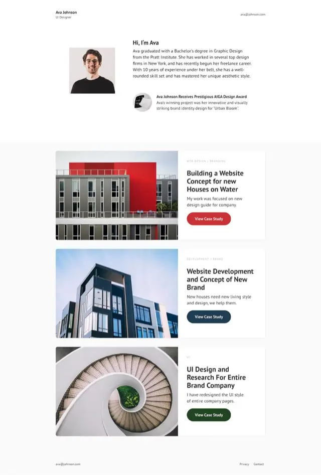
Case study portfolio template
Three case studies, each a wide card with the image on one side and the reasoning on the other. Short, and built to be clicked into rather than read to the end.
Minimal header, intro with portrait and award note, three case-study cards with their own buttons, contact footer
-
Portfolios
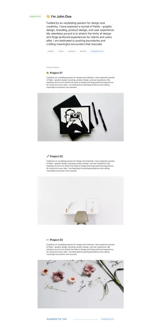
Minimal portfolio template
An availability pill, a paragraph in the first person, and links as pills rather than a navigation bar. Each project is one image and one paragraph, which is the whole design.
Availability pill and first-person intro, pill row of links, three projects each one image and one paragraph, footer repeating the availability
-
Portfolios
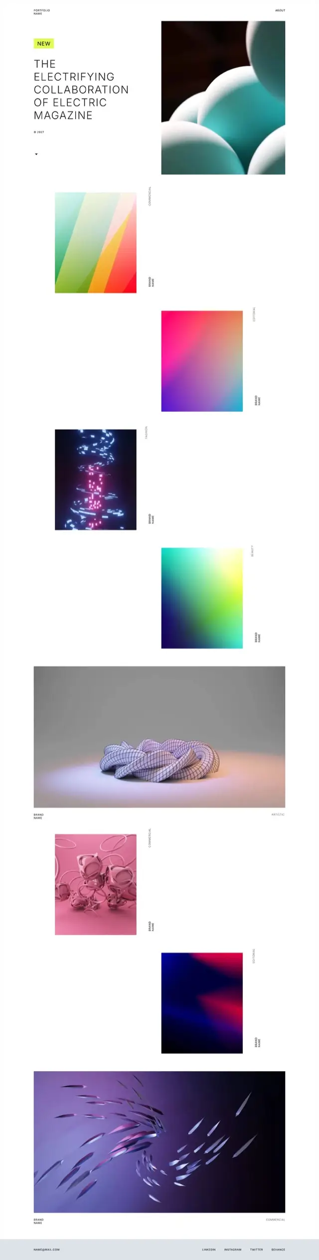
Art direction portfolio template
Almost no interface. Work tiles fall down the page in a staggered column with the discipline set sideways beside each one, so the page reads as a contact sheet rather than a grid.
Headline with new badge, staggered work tiles with rotated discipline labels, two full-width pieces, minimal contact footer
-
One-screen pages
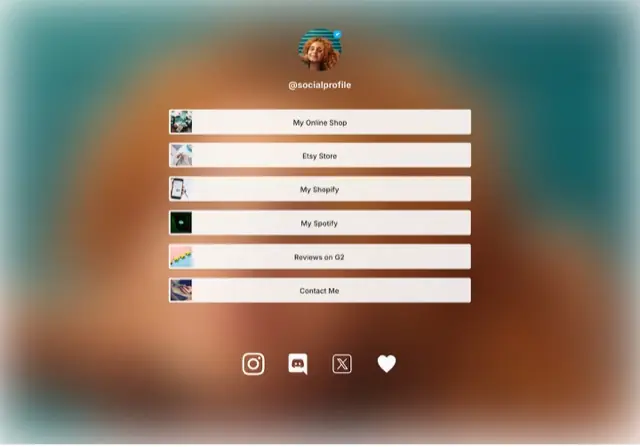
Link in bio template
The only single-screen design here. A verified-style avatar on a soft gradient, six wide buttons each carrying its own thumbnail, and a row of social icons. It ends where the screen ends.
Avatar and handle, six thumbnailed link buttons, social icon row
-

Design it in Figma. Publish it here.
If the layout above already exists as a Figma frame, the plugin sends it over and you finish it on the canvas. Publishing to your own domain starts at $7/mo billed yearly.
Get the plugin -> -
Start for free with Siter.io
Start for free ->
We value your privacy
We use cookies to run this site, understand how it is used, and measure our marketing. You can accept everything, reject everything but the essentials, or choose. See our privacy policy.
Always on
Needed for the site to work - page delivery, security and remembering this choice. These cannot be switched off.
Providers: Siter.io (stores this choice), Cloudflare (delivery and security), Pulsetic (the uptime badge in the footer).
Always on
Counts page views and times how fast pages load. No cookies, nothing stored on your device and no profile of you, so there is nothing here to switch off.
Providers: Plausible (page counts), Pulsetic RUM (page-speed measurements).
Optional
Tells us which pages people read and where they get stuck, so we know what to improve. Unlike the row above, this one stores an identifier on your device.
Providers: Google Analytics (through Google Tag Manager).
Optional
Measures which campaigns bring people here, and lets us follow up by email if you ask us to.
Providers: Google Ads (through Google Tag Manager), Brevo (email and marketing automation).
One thing sits outside these categories: Help Scout loads only if you open the support chat yourself.