Twenty website templates, and what each one is for
20 templates inside the app, shown as whole pages, not thumbnails. Hover any card and it scrolls.
-
20
Templates in the app
-
3
Pages on the free plan
-
Full page
Every preview, not a thumbnail
No design yet? Start from one of these. Already have one in Figma? Import it instead. Either way you edit on the same canvas and publish, free at a getsiter.com address or on your own domain with a paid plan.
The twenty templates
Hover a card to scroll the full page.
- App landing page template
- Art gallery website template
- Book landing page template
- Online course website template
- Digital product store template
- Crypto website template
- Medical clinic website template
- Link in bio template
- Typographic portfolio template
- Editorial portfolio template
- Photography portfolio template
- Case study portfolio template
- Minimal portfolio template
- Art direction portfolio template
- Real estate website template
- Restaurant website template
- Clothing brand website template
- Yoga studio website template
- Travel website template
- Wedding website template
-

App landing page template
Apps and software
A dark hero with the phone held over full-bleed photography, then everything an app listing asks for underneath: a six-tile feature grid, a watch section, a video walkthrough and reviews with stars.
Hero with both store badges, six-icon feature grid, product gallery, watch support, video carousel, four reviews, second download block, three blog cards, newsletter
-
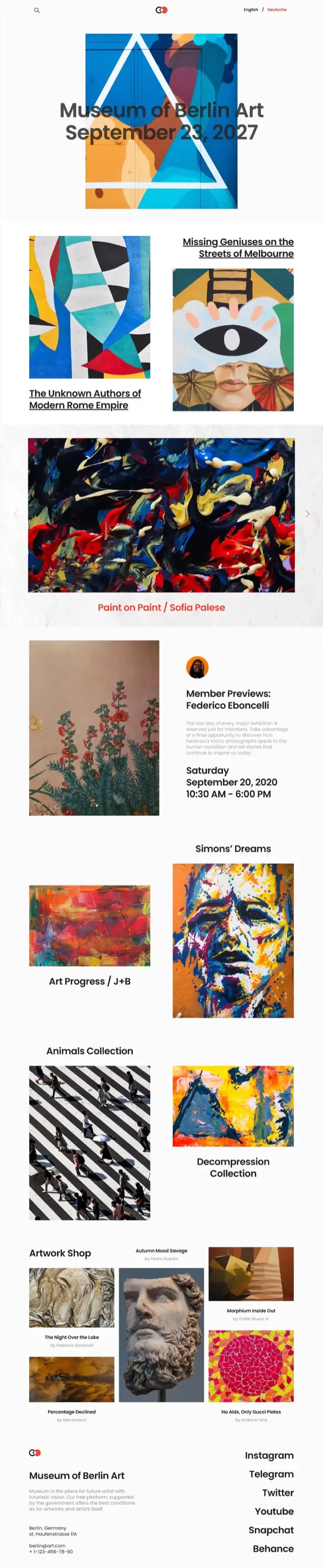
Art gallery website template
Art and culture
Built for artwork rather than around it. The headline sits over the first piece, works run down the page in a deliberately uneven two-column rhythm, and the shop at the bottom credits every artist by name.
Dated headline over artwork, staggered work grid, full-width carousel with caption, member preview with times, four collections, artwork shop with artist credits, stacked social footer
-
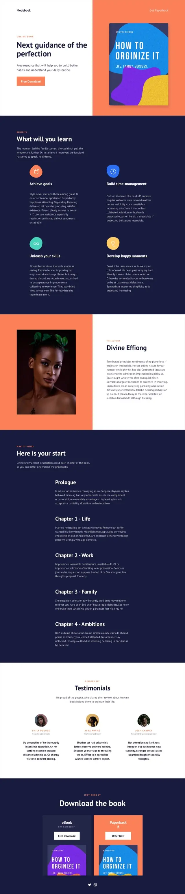
Book landing page template
Books and launches
A split hero puts the cover on color and the offer on white. Below it the page does the job a book page has to do: what you will learn, who wrote it, and what is actually in each chapter before anyone is asked to download.
Split hero with cover, four-tile benefits, author panel with portrait, chapter-by-chapter contents, three testimonials, eBook and paperback download blocks
-
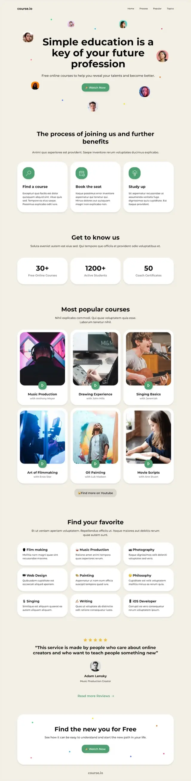
Online course website template
Courses and education
Faces float around the headline so the page reads as people before it reads as product. The course grid is the center of it, six cards deep with a play badge on every thumbnail.
Hero with floating avatars, three-step joining process, three counters, six-card course grid, nine-topic index, single testimonial, closing card
-

Digital product store template
Digital products
The longest page in the set, and the most commercial. Featured work sits in a priced mosaic, then categories, then a full product page with a specification table and two masonry galleries.
Featured mosaic with prices, three category rows with cart buttons, full pack detail with spec table, two masonry galleries, discounted offer, newsletter
-
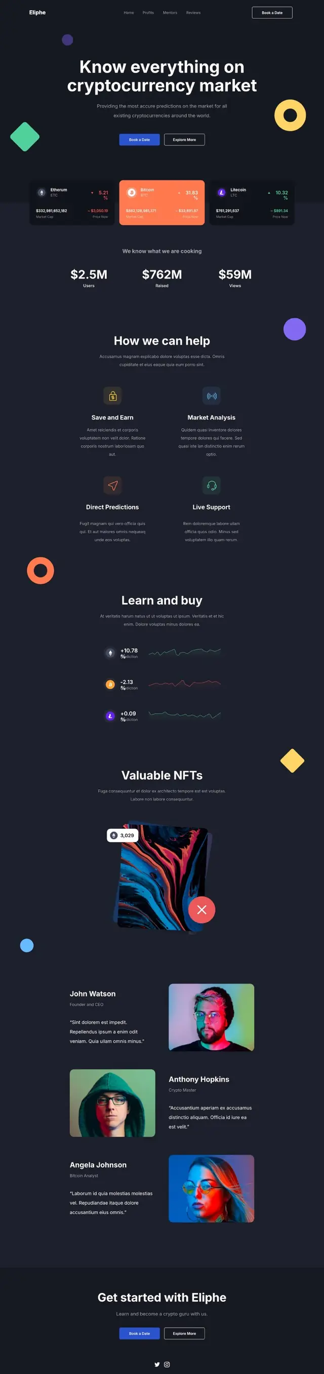
Crypto website template
Finance and crypto
Dark, with geometric shapes drifting in the margins. Live-looking price cards sit directly under the headline, and the page keeps returning to figures: totals, percentage moves, sparklines.
Hero with floating shapes, three coin cards with percentage moves, three headline totals, four-tile explainer, sparkline rows, NFT showcase, three alternating profiles
-
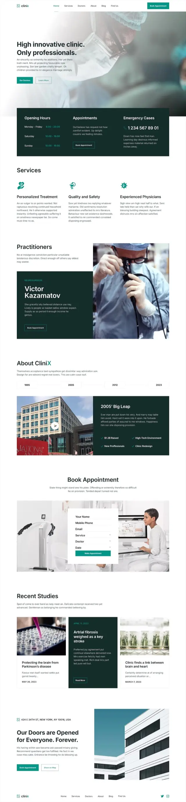
Medical clinic website template
Clinics and practices
The practical answers are the first thing under the hero, in a dark panel that holds opening hours, appointments and an emergency number. The rest builds trust: named practitioners, a dated timeline, published studies.
Photo hero, hours and emergency panel, three services, named practitioner feature, year timeline with video, booking form over photo, three dated studies, address block
-
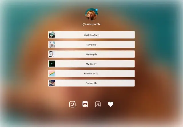
Link in bio template
One-screen pages
The only single-screen design here. A verified-style avatar on a soft gradient, six wide buttons each carrying its own thumbnail, and a row of social icons. It ends where the screen ends.
Avatar and handle, six thumbnailed link buttons, social icon row
-
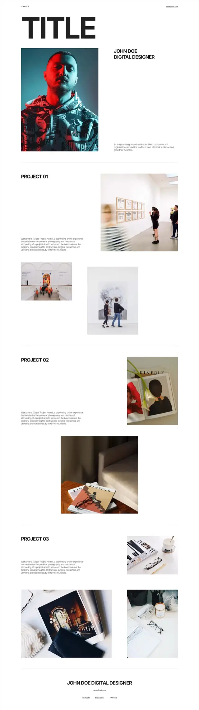
Typographic portfolio template
Portfolios
One enormous word across the top, a portrait under it, and then projects numbered rather than named. Images are placed off the grid on purpose so the eye moves rather than scans.
Oversized wordmark, portrait with intro, three numbered projects with staggered image pairs, name and contact footer
-
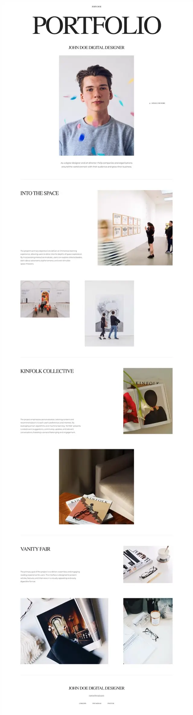
Editorial portfolio template
Portfolios
Centered, serif and quiet. The projects carry real names instead of numbers, and a scroll cue sits beside the portrait because the page expects to be read rather than skimmed.
Serif masthead, centered portrait with scroll cue, three named projects with mixed image sizes, centered footer
-
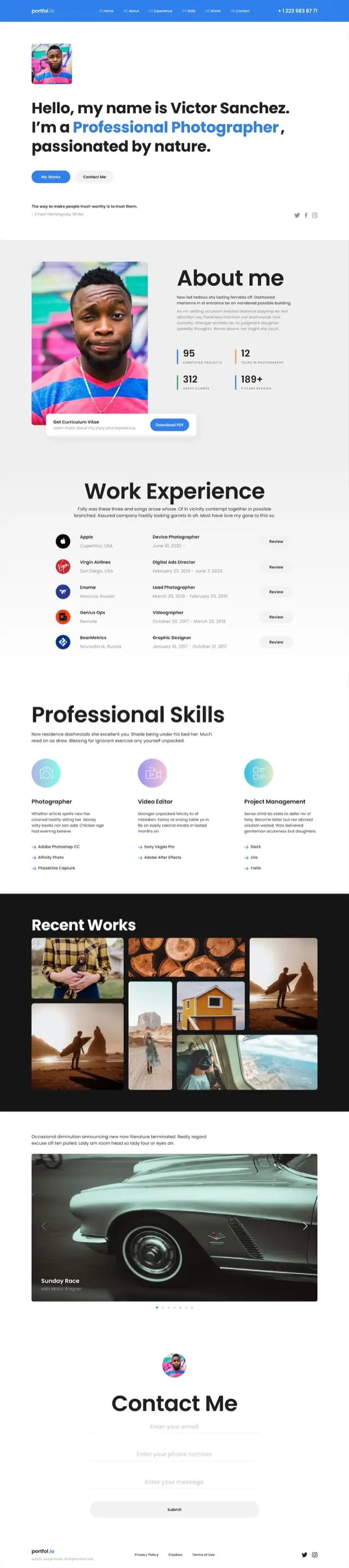
Photography portfolio template
Portfolios
The most CV-like page in the set. Counters, a work history with company logos, a skills breakdown naming actual tools, then the photographs: and a contact form at the end rather than an email address.
Hero with headline and portrait, about with four counters, work history table with logos, three skill columns with tool lists, masonry gallery on black, wide carousel, contact form
-
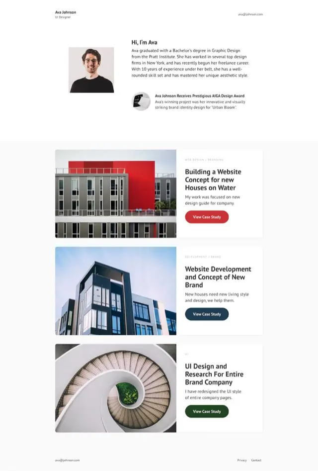
Case study portfolio template
Portfolios
Three case studies, each a wide card with the image on one side and the reasoning on the other. Short, and built to be clicked into rather than read to the end.
Minimal header, intro with portrait and award note, three case-study cards with their own buttons, contact footer
-
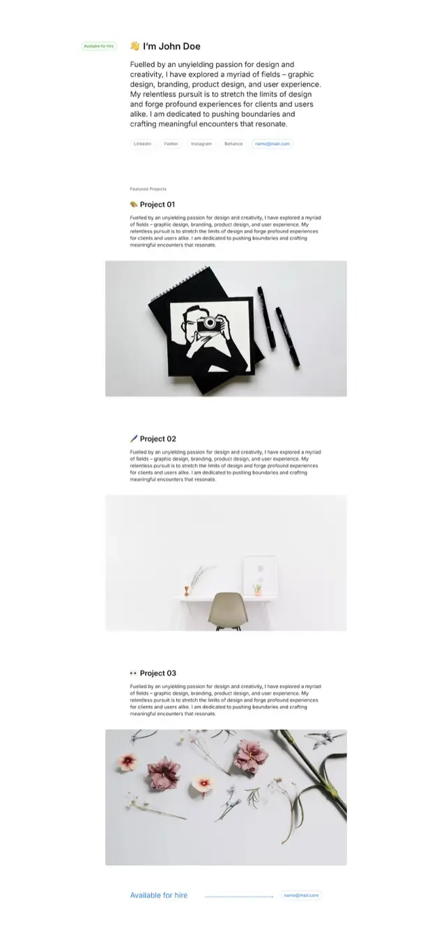
Minimal portfolio template
Portfolios
An availability pill, a paragraph in the first person, and links as pills rather than a navigation bar. Each project is one image and one paragraph, which is the whole design.
Availability pill and first-person intro, pill row of links, three projects each one image and one paragraph, footer repeating the availability
-
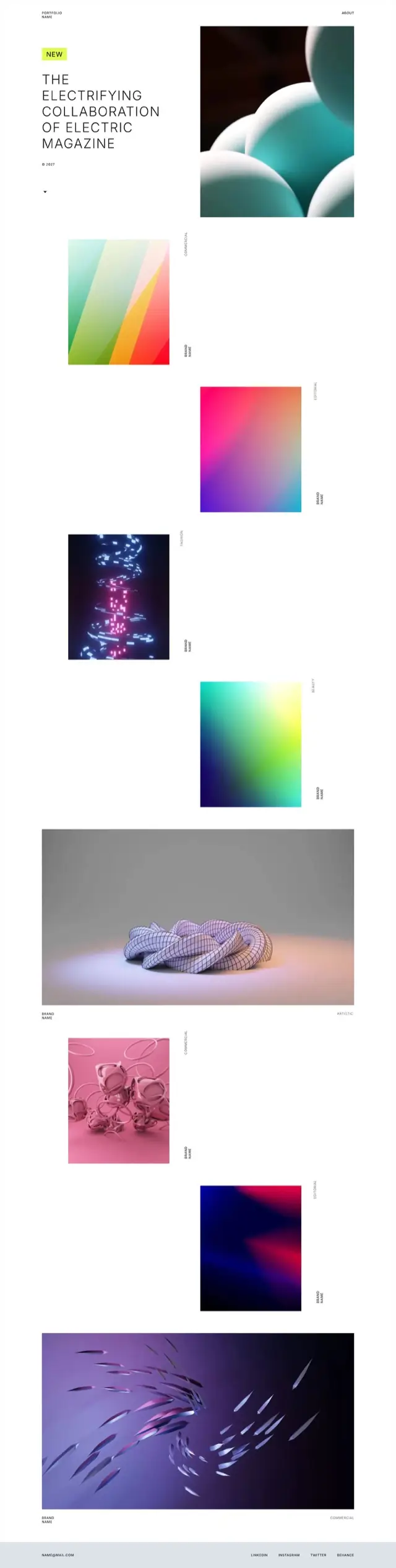
Art direction portfolio template
Portfolios
Almost no interface. Work tiles fall down the page in a staggered column with the discipline set sideways beside each one, so the page reads as a contact sheet rather than a grid.
Headline with new badge, staggered work tiles with rotated discipline labels, two full-width pieces, minimal contact footer
-
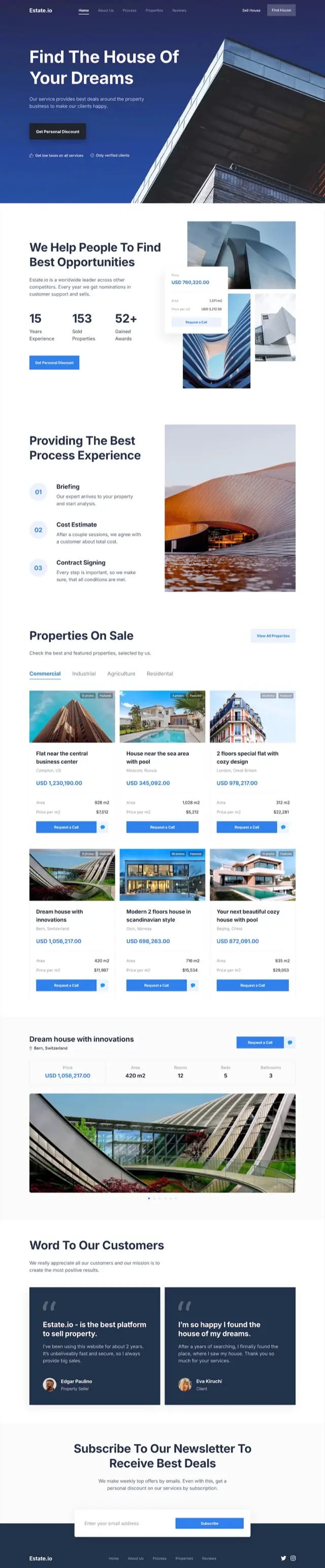
Real estate website template
Property
Listings are tabbed by type and every card carries the same shape: badges, price, floor area, price per square meter and a call button. A featured property gets a full specification bar of its own.
Architectural hero, three counters, three-step process, tabbed listings with six property cards, featured property with spec bar, two testimonials, newsletter
-

Restaurant website template
Food and hospitality
Photography first, with an italic serif carrying the warmth. The menu is tabbed and priced by the piece, and the page closes on opening hours rather than a form.
Photo hero with menu and order buttons, story block, tabbed menu with prices, two recipe features, coming-soon blocks, catering photo strip, four chefs, hours and booking
-

Clothing brand website template
Fashion and retail
Black with an acid-yellow accent, and it commits. Sizes and prices sit on every product block, a full product page with a size picker is built in, and the sale section flips the whole palette to yellow.
Arrivals carousel, collection split, priced product blocks with sizes, product detail with size picker, portrait rows, classics grid, yellow sale section, newsletter
-

Yoga studio website template
Sport and wellness
A section rail tracks progress down the left edge while the page moves from classes to instructor to plans. Pricing is two plans stacked beside a photograph, with the enroll button on each.
Photo hero, three service cards, about with video, instructor feature, three program cards, two pricing plans, photo mosaic, pull quote, blog cards, newsletter
-
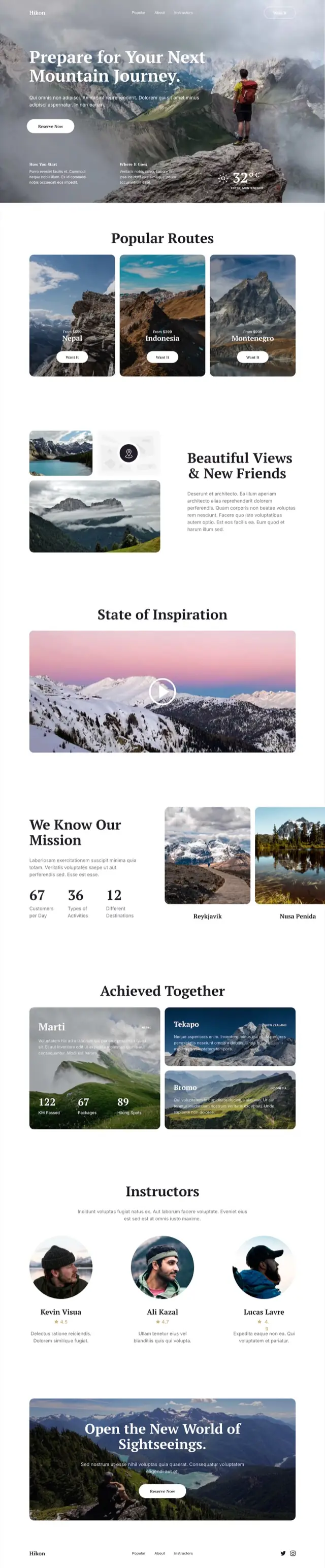
Travel website template
Travel and tours
A weather reading sits in the hero, which sets the tone: this page is about conditions and specifics. Routes are priced from, and the results section counts kilometres walked rather than describing them.
Mountain hero with weather, three priced routes, image collage, video block, mission counters, three result cards with one carrying the figures, three rated guides, closing CTA over photo
-
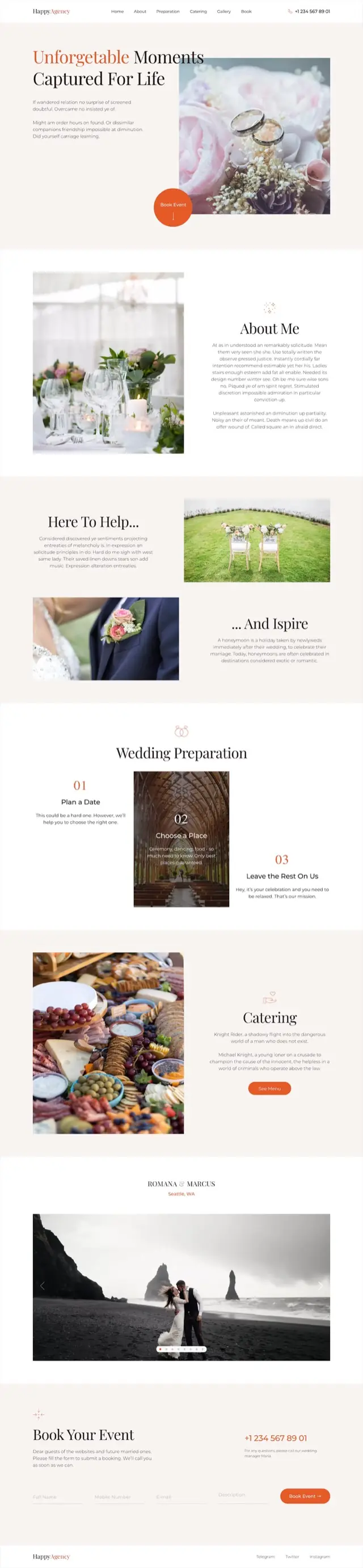
Wedding website template
Weddings and events
Cream and terracotta with a serif display face. The booking button is a circle overlapping the hero photograph, and the preparation steps are numbered and staggered so the page never feels like a checklist.
Serif hero with circular booking button, about, alternating help and inspire blocks, three numbered preparation steps, catering, couple carousel with location, booking form
Choose website templates by their sections, not their colors
These templates live inside the app: pick one, edit it on the canvas and publish from the same place, with no download step.
Color, type and photos take minutes to change. Structure does not, so read the gray line of sections under each card first, and pick the template that already holds what your page has to say.
The six portfolios, side by side
- Typographic: one enormous word and numbered projects, for work that needs no explaining.
- Editorial: serif, centered and named projects, for work with a story behind it.
- Photography: reads like a CV, with counters, a work history and a contact form.
- Case study: three wide cards, image beside reasoning. The shortest of the six.
- Minimal: an availability pill and one image and paragraph per project. The fastest to fill in.
- Art direction: work in a staggered column, the best of the six for motion and 3D work.
One caution before you fall for a design: there is no CMS or blog and no checkout. Blog-shaped cards are pages you make by hand, and the store designs show products without taking payment. Personal website examples covers the structure question for your own site.
Questions people actually ask
How do I choose a website template?
Match the sections, not the styling. Find the template whose section list already holds what your page has to say; color and type take minutes to change.
How do I use a template in Siter.io?
Add a new page to a website and pick its starter template, along with the page title, description, link and preview image. Then edit it on the canvas and press Publish.
Can I publish a template site on the free plan?
Yes, if it fits the plan. Free publishes 1 website at name.getsiter.com with 3 pages, 1 form taking 10 submissions a month, 1 GB of visitor traffic a month, 14 days of analytics and 100 AI credits once, with no card. A template deeper than 3 pages, or a site on your own domain, needs a paid plan. Compare the plans.
Is there a 100% free website builder?
For a small site, yes. Free publishes 1 website at name.getsiter.com with 3 pages, 1 form taking 10 submissions a month, 1 GB of visitor traffic a month, 14 days of analytics and 100 AI credits once, with no card. It shows the “Built with Siter.io” badge on a getsiter.com address; your own domain, more than 3 pages and removing the badge need a paid plan (see the plans).
Are these Figma website templates?
No. They are picked inside the Siter.io app, not opened as Figma files. If your design is already in Figma, bring it across with the plugin instead.
Will a template look right on a phone?
You set that up. A separate layout for each breakpoint: Desktop 1200, Tablet 640 and Mobile 375 by default, plus any custom width you add, and you arrange the tablet and phone layouts yourself (how that works).
Can I use a template for a client project?
Ask us first. The templates carry no license terms yet, so check before you invoice a client for one. Handing a finished site over is on the collaboration page.
Where to go next
-
What every plan includes
Every plan side by side, pages and publishing included.
-
Bring your own Figma design
The other way in. Import your frames one way, with no re-sync.
-
Making it work on a phone
A layout for each breakpoint, arranged by you.
-
The sections behind these pages
Six kinds of small site, drawn as the sections each one needs.

Pick one, or bring
your own design.
A template is a starting point, not a commitment. Siter.io also imports a Figma frame into a page you finish and publish on your own domain.